Dennis and I got home Sunday January 12th after being at the Atlanta show for five days. There was a really bad virus and cough going around and we both got it. Luckily not at the same time. So we were able to spell each other at the show. I still have it and it has has slowed me down. and since I am a bit late now to report on the show, I’ll write on some topics related to trade shows. There is a lot of important things to say about the show (or any trade show you go to) . I am going to start with: Trends
How and where to spot them at the show. (At the end of this blog I will mention other good sources of trend spotting).
At the shows Look for trends that predominate and show up in at least 5 major showrooms and more. In Atlanta Showrooms like C & F , Manual Woodworkers and Evergreen are good for trend spotting.
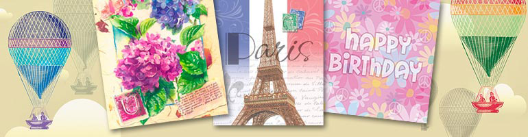
Check out the fashions you see in the halls and showrooms – We saw, of course chevron, animal prints,lots of patterns, and combinations of patterns. At the July show I am sure we will see lots of floral patterns.
Check colors and patterns that appear in the showrooms- Seen were a lot of the warmer colors in the orange, pink and coral family. Also sunflower yellow. In the Cools were, you guessed it Blues. Lots of Aqua, Cobalt and Navy. Lots of warm and cool grays combined with the blues and warm shades.

Patterns and bright colors
Spot recurrent themes – Foxes and owls still around. Woodland animals, deer, moose etc. are showing up. Not as much as was predicted a year ago. The little Hedgehog so popular in England didn’t live up to last year’s predictions. We saw some, but not enough to call it a big trend,.
I saw a good showing of black and white designs, patterns and black line art combined with watercolory butterflies, flowers. This last was starting to appear last year in gift wear fashion and tabletop.

Black and white line art with some color
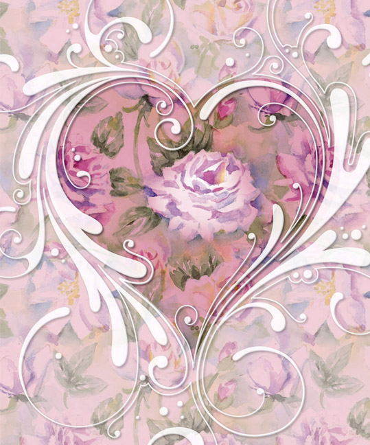
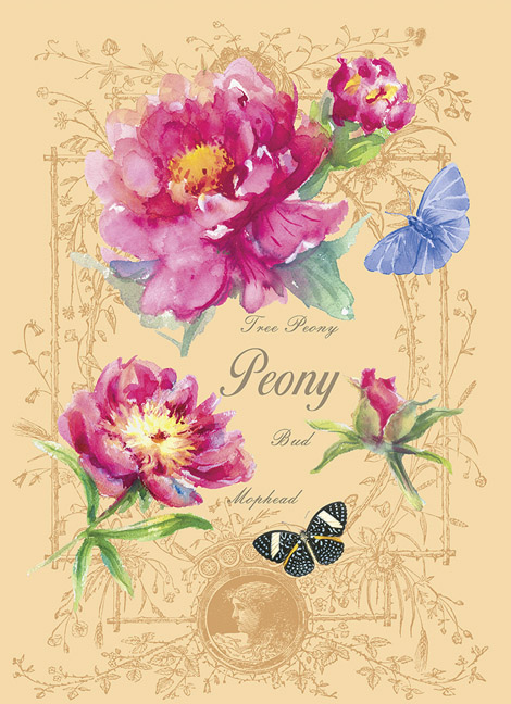
LOOSER WATERCOLOR AND NATURE THEMES, especially birds and flowers
Photos of two products in a line sold by Overstock.com by yours truly. This look on Home decor products has been coming about in the last 5 years. And you can bet I am happy about that. The products will be on the Overstock site in late February.

Overstock.com Duvet

OVERSTOCK.COM HUMMINGBIRD DESIGN
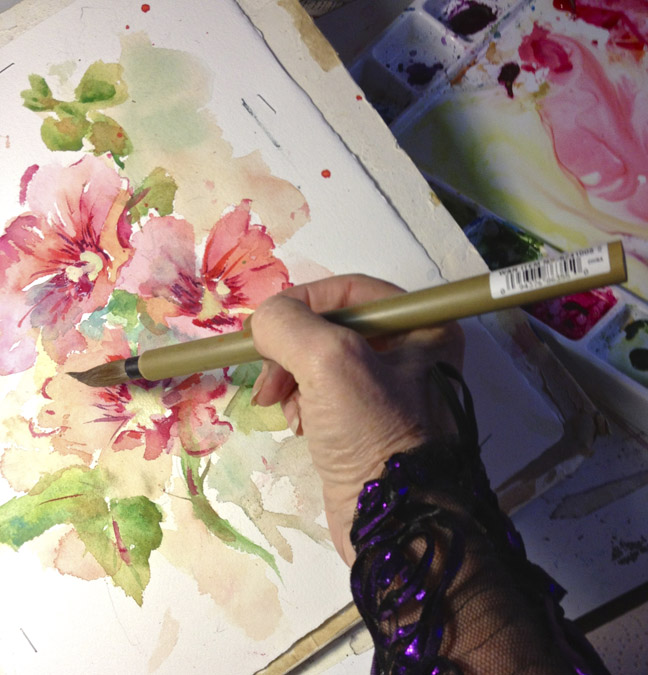
Looser Watercolor styles on Paper. This look has been popular on pillows for 3 or 4 years and is now appearing on other products.
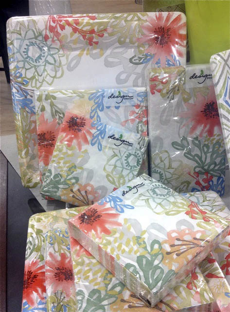
Looser watercolor designs

Collage style inspirational art where the art is very stylistic. These two pieces by Kelly Rae Roberts and Lisa Kaus are good illustrations. Type is used in unusual and varied styles often looking like a snippet of typewriter type. Kelly and Lisa were among the artists that first developed this style around 5 or 6 years ago.By now I’m sure if you have been looking you’ve seen lots of other artists now doing this look. I remember seeing this style and the artists who did it for the first time in the Demdaco Showroom in Atlanta. Then it was new. Now there are many artists doing this look. It caught on and became popular. With artists and with the public

Kelly Rae Roberts collage style

Lisa Kaus collage inspirational style
Some Themes that come to mind as always popular.
Coastal. I think that we saw a lot more than in past years.
Birds, florals and patterns. (I read in Gifts and Dec Accessories that florals are trending again this year in home decor.
Wine and grapes
Traditional Holiday
Other ways to follow trends:
Check the Pantone color reports for the current year. This is the palette I saw a lot of at the show. And it should be showing up more as Spring is being show in stores.

Pantone colors Spring 2015
“About the PANTONE Color of the Year
The Color of the Year selection requires careful consideration and, to arrive at the selection, Pantone combs the world looking for color influences. This can include the fashion and entertainment industries – including films that are in production, the world of art, popular travel destinations and other socio-economic conditions. Influences may also stem from technology, the availability of new textures and effects that impact color, and even upcoming sports events that capture worldwide attention. “
This years color is marsala. It is the luscious rich red brown. Watch for it to start appearing all over!
I try to think of trends when I do my nature paintings. But don’t always incorporate them. If I am working on a collaged piece with Dennis then we are mindful of trends More decorative artists like Jennifer Brinley do use them in a lot of their designs.
Whether you choose to use these colors in your art or not it helps to be aware of them. Don’t feature colors that are out of date for that year.
Some other ways that I follow trends are: Remember that, The trends start in fashion and apparel move to home decor rugs furniture and tabletop and then giftware. ) It can take a year or two for this moving along of the trends. It seems to me that they move from one market to the next faster now than say 5 years ago.
Trade Magazines. Especially Gift and Decorative Accessories
Watch QVC on TV to see what is trendy in fashion.
Visit local gift shops. Talk to the shop owner and see what they are considering hot trends.
Check some of the trendier stores on the internet: ex: West Elm, Anthropologie, Pottery Barn, Pier One
Go to other trade shows. There are so many around the country.
I was going to make this a short post. Ha ha lol.
It is a cold night in the big apple and I smell Apple and Butternut squash soup from the kitchen. Let me know about other trends you are spotting.
So I will end here. Stay warm and if you are in a warm place
enjoy it!