I had hoped to get this posted sooner ……..but……..after the show we went to visit our good friends Pat and Arthur Ginsberg in Palm Beach.Where it was…..you guessed it warm! It was a good chance to relax and chill out. While there we visited The beautiful and serene Morikami Gardens

Zen Garden Palm Beach
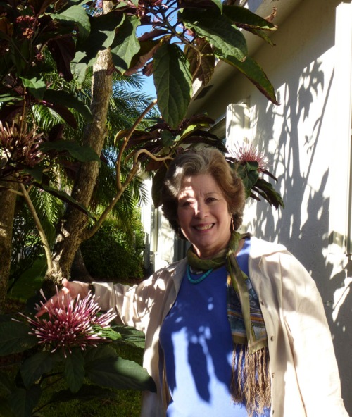
Relaxing in Palm Beach
It was a welcome mini vacation and time with dear friends, light and sun.. Then back to the Arctic freeze in NYC.
TIP: Make sure to give yourself rewards for a job well done.
Having fun and relaxing is an important part of it all!
Since we’ve been back a week we’ve just devoted ourselves to the show follow thru. This is a very important part of the process. Don’t neglect any detail. Send what you have been asked and on time, early if possible.
TIP: Plan ahead on your calendar for follow thru time.
This may very well be the most important part of the process.
We had set up 6 meetings before we left NYC and in three days at the show we ended up having 15 very good meetings with manufacturers we had wanted to see. And…….lots to follow up on. Designs to send out from our portfolio, revisions and additions to existing designs and reformatting for specific products.This time we also came back with some resin figurines to design. No contract yet but not a reason not to follow thru!
TIP: Stop in at the showrooms you’d like to have a meeting with.
If the art director is there request a meeting.
If he or she is not free then set up a time to come back and meet.. Sometimes there is someone who can see you on the spot.
More than 50% of our meetings happened this way.
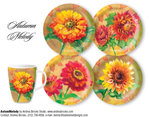
Autumn melody mocked up as tableware
One of our mockups is for the Autumn Melody design.Showing dessert or salad plates and mug designs.Again no contract yet but very important to follow up on specific requests for reformatting designs.
By the end of this week we may be finished with most of the the follow up. Give as much time and thought to this stage as you did to planning for the show.
TIP: Follow through also includes making updates in your contact files.
Entering information about Manufacturer’s schedules for the year to come.When will they be looking for what and what the cut off dates are. Get your submissions in as early as possible.
We also saw some of the products and collections that came out of our show meetings in January and from subsequent mailings. This is such fun.
Dennis sends out our new designs regularly to our manufacturer and client base. One of the new contracts that resulted from this kind of mailing are the new Peacock coasters and trivets for Thirstystone.
TIP: Have a system for getting your new designs to clients.
Show them off on Social media, blogs and mailings!
In my previous post I showed how the peacock design came about. I got great feedback on this post. I love to read about how a design was done.
This was a team effort. And the other half of my team is so important to our designs.
Dennis Kendrick was a great gift and came into my life 33 years ago. He is a terrific designer/illustrator and very knowledgable on the technology side of things. My best friend (in addition to my sister Pat), smart, intellectual, funny and so solid and down to earth. Without him to anchor me I would be in outer space much of the time!
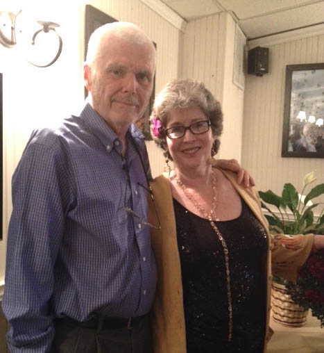
Our team
I was so excited to see the products at the showroom and to meet with Thirstystone again. This was another wonderful company that we met with at the July show. Totally unusual for me. I take so many pictures.
At the Dallas Gift show just after Atlanta The Dallas Arboretum picked up the design as a name drop for trivets. Name drop I found out means that The
logo of the Dallas Arboretum will replace our french label. We haven’t seen it yet but it seems like another good placement. We are keeping our feathers crossed that our peacock gets good placements and lots of them.
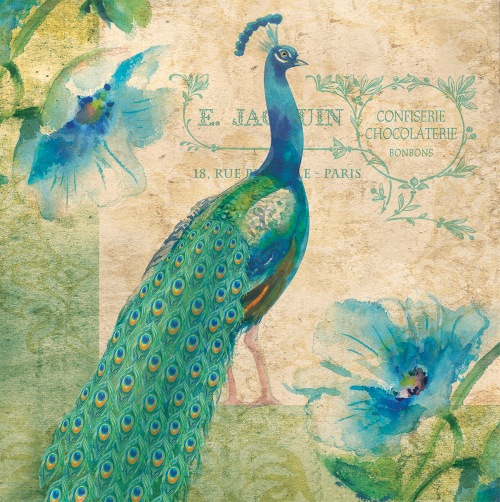
Our Peacock
We also found out at the show that Custom Decor, a flag company will be doing three of our Christmas designs as flags, mats and mailbox covers. We’ve been designing borders for these products.I won’t show them until they debut at the July Atlanta Show. Custom Decor was a company we met with in Atlanta in January and we are very pleased to have them as a new licensing partner.
Seeing our new stained glass “Trellis” collection at the Amia Showroom was so exciting. There are around 15 or so different and beautiful products in this collection. I found it difficult to take photos because there was so much reflection from the lights on the stained glass and the mirrors on the shelves. And I wanted to take one of the Artist in front of her noew collection shots. But the shelf was too low!
Here are the best shots from the showroom. We’ve been so busy since we got back that there hasn’t been enough time yet to unpack all our lovely samples which arrived just before the show.
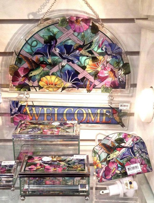
Some of the Amia collection
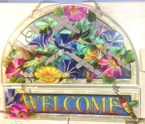
One of our favorites
And in between meetings we had lunch, coffee or met colleagues in the showrooms or hallways and always stopped to chat. We had dinner with our good friends Ingrid and Duane Slyder of Ingrid at Nutshell Designhs. That was a highlight of our visit to Atlanta.
TIP: Networking is very important.
And fun too!
It is social and enjoyable. Then too it is a way to compare notes or ask questions, get information and share the joys and tribulations of being a licensing designer.
We saw five of our designs in the Jelly Bean showroom. Two of them are coastal themes. JellyBean does very nice quality area rugs. The cats are going to love our new Jellybean area rugs and so will we. The one with the feet requires a special order!
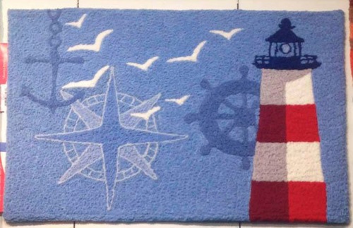
Jellybean Lighthouse Rug
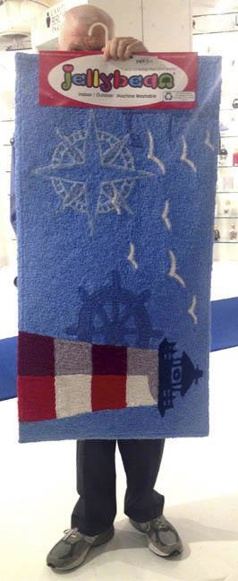
This one has legs!
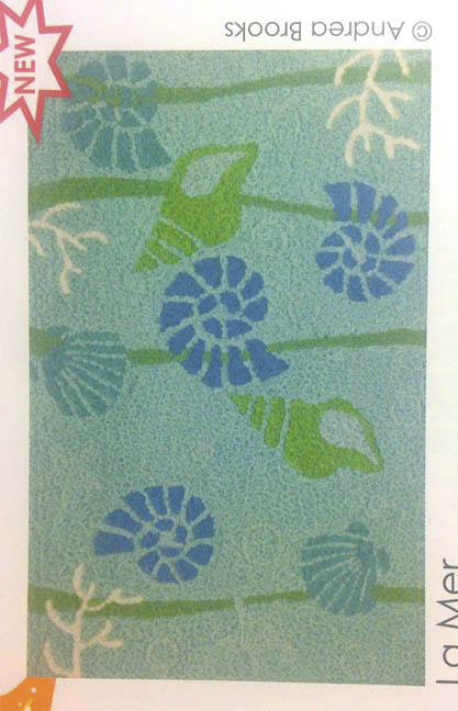
Shell design Jellybean
I have been reading Joan Beiriger’s three part posting on the Atlanta show.
“Licensed artist Joan Beiriger is widely regarded as an expert in art licensing. Her popular blog features informative articles designed to educate those interested in the art licensing industry and attracts hundreds of readers each week.” Joan’s maintains a web site, Joan Beiriger’s Art for Products,http://www.joanbeiriger.com/JoanBio.html. Her blog, is always full of wonderful information and is a great source material for all of us in the industry,joanbeiriger.blogspot.com/ Thank you Joan.
“One of the points she brings up that I have found so helpful is asking lots of questions. Talk to the sales reps. They can tell you what is selling well and why. Ask questions in your meetings to get to know more about the company and its needs so you can target designs in their direction. Exchange some personal information. Remember you are forming a relationship not just looking for new licensees. I am a people kind of person and love finding out about clients families, pets, what their life is like etc. A friendly and well meaning Yenta maybe!
TIP: Make notes of these conversations too and when you get back to your studio enter this info in your contact data base.
This information will help you to develop a more personal relationship with theCreative Director and give you more of an understanding of what his or her lifestyle is like.Find out about them on social media. What is their professional background?
It is much more fun to be sociable. I do this not only with our licensing partners but with our friends and family. Don’t expect to keep it all in your head.I like to keep up.
Another very good point that Joan makes is; ” Also notice what products the buyers indicate to showroom reps they want to purchase. Every bit of knowledge leads to insight on the art that buyers think their customers will buy. And, that will help you decide on the art themes to create that will have a better chance in getting licensed.”
Talk to and listen to gift shop owners. I have found that I can get valuable info on trends and best selling products from these talks. At the show and when you are in gift shops. Talk talk talk.
TIP:Remember that February is “cabin fever” month
Plan fun things to do, not just work! It’s a good time to send a bright and cheery message to your clients. We all have missed the sun!
And a happy New Year to all. I missed my New Year’s post so here’s my wish for you now. Enjoy life as much as you can. Laugh every day. And spend time doing what you love to do!
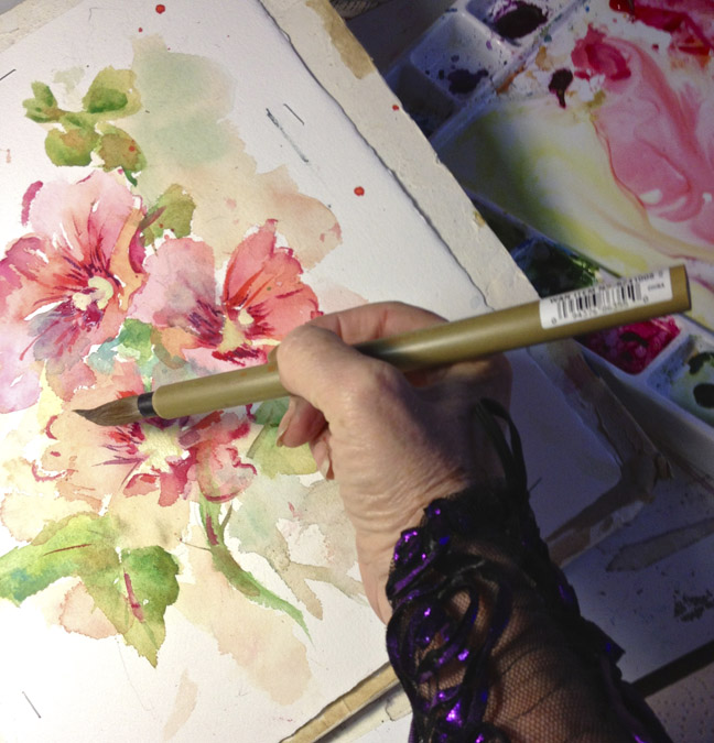
My painters cap is on again and I ready to rock and roll again.
My Painters cap is on again